


Table of contents
- Introduction
- 1. What is a Grid?
- 2. Terminology of CSS Grid
- 3. Creating a Grid - display: grid
- 4. Grid Direction - grid-auto-flow
- 5. Grid Types - explicit vs implicit
- 6. Naming Grid Lines
- 7. Positioning Grid Items
- 8. Alignment of the Grid Items
- 9. Nested Grids
- 10. subgrid value for grid-template-rows/columns
- 11. Grid Gap
- 12. Fractional Unit - fr #responsive-design
- 13. auto-fit & auto-fill keywords #responsive-design
- 14. Flexbox VS Grid: which and when?
- Conclusion
Introduction
I suppose you have already learned about Flexbox until now. To put it simply, CSS Grid is Flexbox with superpowers.
In the world of CSS, we currently have one-dimensional layouts and two-dimensional layouts:
One-dimensional layout = boxes are positioned in only one direction (remember, each element on the page is a box). Think of normal flow or Flexbox. You can either position elements vertically OR horizontally.
Two-dimensional layout = boxes are positioned in both directions, vertically AND horizontally.
We're gonna take a look at the features that Grid comes with, and later on, we will discuss whether Flexbox is better than Grid (or vice-versa), and when and why to use one over the other.
1. What is a Grid?
This might seem stupid to talk about, but as a non-native English speaker this word seemed strange to me, and I want to emphasize the way you should think about your webpage when creating the HTML structure.
For some people, I think the simplest definition could be a chessboard or a regular notebook page. Let's think about a chessboard as an example.
So you have a chessboard (the grid), which holds all chess pieces (the elements). Each row of the chessboard (in the vertical direction) has a number, and each column (in the horizontal direction) has a letter. When you move a chess piece, you are essentially changing its position on the chessboard by using the numbers and letters as reference. It's the same with the grid on a webpage.
2. Terminology of CSS Grid
Before learning more about CSS Grid, we first need to understand what it's made of.
In non-web terms, our chessboard is simply a big square that holds many other squares, and each square is made up of 4 lines. Then we have rows and columns that are made of squares.
Now we're gonna talk about the actual grid structure. Make sure you truly understand each term before moving on, because this is the foundation of any CSS Grid.
Here we have an 8x8 chessboard, with 8 columns (horizontal direction, from a to h) and 8 rows (vertical direction from 1 to 8):
Grid Container = the parent element on which display: grid was applied to. And it's also the element that holds everything the grid has.
Grid Items = the direct child elements of the parent element (grid container)
Grid Cells = each square of the grid container, in which a grid item gets placed in
Grid Lines = each line of a grid cell (remember, a square has 4 lines)
Grid Tracks = space between two lines in the same direction (you can think of them like the grid rows and grid columns).
Grid Rows & Columns = see above
Grid Area = space made up of one or more cells (squares)
3. Creating a Grid - display: grid
We're starting small to make sure that you understand the concepts. Once you get a grasp of them, you can easily scale up the dimensions of the grid.
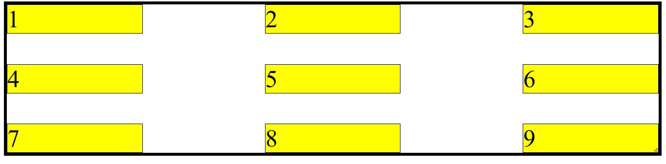
So, let's go for a 3x3 grid-container this time.
Do you remember what is called the main square (biggest) that holds all the squares inside? Grid container. That's what we need to create first.
Consider this HTML structure for a 3x3 grid container:
<!-- index.html !-->
<div class="main-container">
    <div class="square one">1</div>
    <div class="square two">2</div>
    <div class="square three">3</div>
    <div class="square four">4</div>
    <div class="square five">5</div>
    <div class="square six">6</div>
    <div class="square seven">7</div>
    <div class="square eight">8</div>
    <div class="square nine">9</div>
</div>
To make use of the grid layout, we need to set display: grid to the parent container .main-container :
.main-container {
    display: grid;
}
"But wait, nothing has changed!" you might say. That's because you need to apply additional CSS properties on the grid container (.main-container in our case).
Let me introduce you to two new CSS properties available for the grid container:
grid-template-columnsgrid-template-rows
Both properties can take one or more values of <length> data type. Each value given to them creates a grid column, respectively a grid row.
.main-container {
    grid-template-columns: 30px 30px 30px;
    grid-template-rows: 30px 30px 30px;
}
That creates a grid container with 3 rows and 3 columns:
repeat() CSS function available as a value for those two properties, so that you can create rows/columns of the same size much easier and shorter. For example, grid-template-columns: 100px 100px 100px is equivalent with grid-template-columns: repeat(3, 100px).4. Grid Direction - grid-auto-flow
By default, grid properties have some default values. One of them is grid-auto-flow which is similar to Flexbox's flex-direction. It tells in what direction to put the grid items, and by default it's row (vertical), so it's showing up like a regular block flow. If you set grid-auto-flow: column (horizontal), then the items will be placed like inline flow.
.chessboard {
  border: 5px solid black;
  display: grid;
  grid-auto-flow: column;
}
5. Grid Types - explicit vs implicit
Grid has an auto algorithm that deals with any new grid items (elements) that get added. If there are no more available grid cells to place the grid items into, then the grid's algorithm automatically creates new grid cells in the default direction (row - horizontal). Once this happens, the grid is called implicit grid.
An explicit grid is a grid that has enough rows/columns for the grid items, created by you with grid-template-columns/grid-template-rows.
Basically:
implicit grid = rows/columns are created automatically for new grid items
explicit grid = rows/columns are created by you and all the grid items have its place
grid-auto-rows and grid-auto-columns properties. It can take the same values as grid-template-rows/columns properties.6. Naming Grid Lines
By default, grid lines are numbered, but you can change that to a custom name, which you'll only see while inspecting the grid with DevTools.
.main-container {
  display: grid;

  /* named grid lines */
  grid-template-columns: [first-line] 200px [second-line] 200px [third-line] 200px;
  grid-template-rows: repeat(3, 200px);
}

7. Positioning Grid Items
There are two ways we can do this:
Define where a grid item starts and ends based on the lines of the grid.
Assign a name to each grid item, and create the grid by using those names.
The First Method: grid-row & grid-column properties
Each grid cell is made up of 4 lines, and each line is numbered. So, we have lines in both directions, row (vertical) and column (horizontal).
Those two properties can be applied to grid items, and they're shorthands for grid-row-start / grid-row-end and grid-column-start / grid-column-end. The shorthand properties take two values delimited by a /(slash), the first one being the start, and the second one the end. The second value can be omitted, and it'll automatically adjust.
Here's an example:
/* grid items */
.one {
  background-color: red;
  grid-column: 1 / 3;
  grid-row: 1 / 3;
}

.two {
  background-color: cyan;
  grid-column: 2 / 4;
  grid-row: 3;
}

.nine {
  background-color: pink;
  grid-column: 3;
}
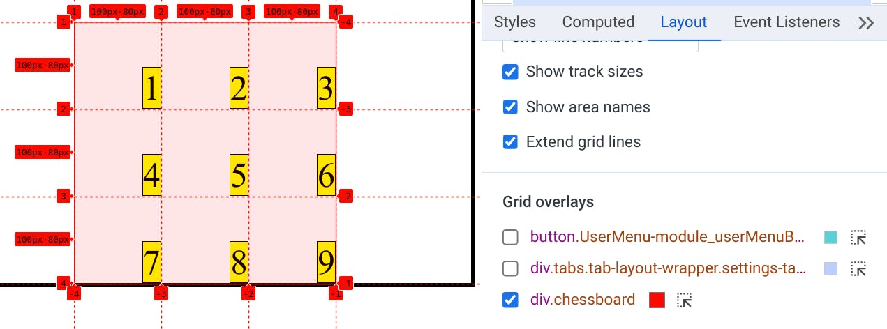
If you can't imagine the line numbers, then you can open DevTools > Layout tab, and click on the grid container. Then pick Show line numbers in the dropdown menu.

The Second Method: grid-area& grid-template-areas
We can name any grid item by using the grid-area property:
.square.one {
   grid-area: first;
}

.square.two {
   grid-area: second;
}

.square.three {
   grid-area: third;
}

/* ... */
.square.nine {
   grid-area: ninth;
}
Then we use those names as values for grid-template-areas property, as a comma-separated list. We can provide many lists. Each value of the list is a grid cell, so we end up with rows and columns.
.main-container {
  /*
     __________________________
    | first   | second | third |
    | fourth  | fifth  | sixth |
    | seventh | eigth  | ninth |
     ⎻⎻⎻⎻⎻⎻⎻⎻⎻⎻⎻⎻⎻⎻⎻⎻⎻⎻⎻⎻⎻⎻⎻⎻
  */
  grid-template-areas:
    'first second third'
    'fourth fifth sixth'
    'seventh eigth ninth';
}
This is equivalent to:
.first {
   grid-column: 1 / 4;
}
.second {
   grid-column: 1 / 3;
   grid-row: 2 / 4;
}
.third {
   grid-column: 3;
   grid-row: 2 / 4;
}

/* and so on for the other cells */
grid-template-rows/columns property, so each cell takes equal space based on the available space in the grid container.Using grid-area as a shorthand
There's one more use case for the grid-area property. Apart from being able to name grid items for grid-template-areas, we can also use it as a shorthand for grid-row-start / grid-column-start / grid-row-end / grid-column-end.
For example:
.square.one {
    grid-area: 2 / 1 / 5 / 6;
}
Is equivalent to:
.square.one {
    grid-row-start: 2;
    grid-column-start: 1;
    grid-row-end: 5;
    grid-column: 6;
}
In general, shorthand properties can be pretty useful for writing cleaner and shorter code, and you can see how helpful it can be in this case.
8. Alignment of the Grid Items
Aligning items means to move the items within its container.
Remember Flexbox? You could move flex items to the start, end, and center of the flex container. You could also take the available space of the container on the direction and put it between flex items (space-between, space-around). It's the same with Grid!
Those are the alignment properties that work on the grid container:
justify-content,align-content- to move the grid container around when there is available space around the grid (so the grid is smaller than the actual container)justify-items,align-items- to move all grid cells / items across the vertical/horizontal direction within their grid cells.
.main-container {
  height: 25rem;
  border: 5px solid black;

  /* make this element a grid container */
  display: grid;

  /* create rows & columns */
  grid-template-columns: repeat(3, 100px);
  grid-template-rows: repeat(3, 100px);

  /* move the whole grid around in the container */
  justify-content: center; /* horizontal direction (column) */
  align-content: end; /* vertical direction (row) */
}
See how the whole grid is centered and placed at the bottom
And moving the grid items inside their cells:
.main-container {
   justify-items: end;
   align-items: end;
}
And you can apply those properties directly on the grid items to move them individually within their cell:
justify-selfalign-self
9. Nested Grids
We have a grid container with a grid item (a parent HTML element with a nested element). We can make that grid item also a grid container with the same display property. That grid item becomes a nested grid, which can hold grid items itself.
<div class="main-container">
    <div class="square one">
      <div>nested item 1</div>
      <div>nested item 2</div>
    </div>
    <div class="square two">
    </div>

   <!-- etc. -->
</div>
.main-container {
   display: grid;
   grid-template-columns: repeat(2, 100px);
}

.square.one {
  display: grid;
  grid-template-columns: 80px 80px;
}
You can see in the above example that the first cell is a grid item of the .main-container grid container, but it's also a grid itself that holds two nested grid items. Make sure you check your grid in DevTools too!
10. subgrid value for grid-template-rows/columns
By using the subgrid value for grid-template properties on nested grids, you tell it to inherit the same lines of their parent grid, so everything gets aligned nicely. Basically, it creates the same rows/columns as the parent.
11. Grid Gap
This works just like in Flexbox. We can add space between all the grid items. We apply this property on the grid container.
.main-container {
  border: 5px solid black;
  display: grid;
  grid-template-columns: repeat(auto-fit, minmax(150px, 1fr));
  gap: 50px;
}

gap is actually a shorthand for row-gap and column-gap, so we can provide it two values separated by a space.
.main-container {
  border: 5px solid black;
  display: grid;
  grid-template-columns: repeat(auto-fit, minmax(150px, 1fr));
  gap: 50px 200px;
}
Now we have 50px gap between rows, and 200px gap between columns:
12. Fractional Unit - fr #responsive-design
This works similar to Flexbox's flex-grow property. It works with the grid-template-rows/columns property. If you give each row or column 1fr, then all of them will be equal in size because the available space of the grid container gets distributed equally.
Let's take a look at the following example where the squares take equal space:
.main-container {
  border: 5px solid black;
  display: grid;
  grid-template-columns: 1fr 1fr 1fr;
}
We can also make a grid column take more space ( fr units) than the others, thus being bigger. See how the second column is 4x times bigger than the others.
.main-container {
  border: 5px solid black;
  display: grid;
  grid-template-columns: 1fr 4fr 1fr;
}
13. auto-fit & auto-fill keywords #responsive-design
This is a pretty cool feature of the grid. You can tell it to dynamically resize the grid rows and grid columns so that the grid items can fit in.
Those two keywords can be used in the repeat() function for grid-template-rows/columns, together with the minmax() function.
The minmax() function takes two values: a min with a fixed unit, and a max with a dynamic unit.
For example:
.main-container {
  border: 5px solid black;
  display: grid;
  grid-template-columns: repeat(auto-fit, minmax(150px, 1fr));
}
As you can see, the grid container will have as many columns as it can fit based on the min size (150px). The columns will grow equally in size (due fr unit), and they keep growing until there's 150px available for one more column (which means that the grid container's width is at least c * min, where c is the number of columns wanted, and min the min size.
Let's say we start with 3 columns because we have a smaller browser window. If we make it wider, then the grid columns start growing. When the grid container can fit one more column (must be at least 3 * 150px wide), all the grid columns shrink to the min size. If the window actually gets smaller, then the same will happen but in reverse: a column will get removed and its grid item will automatically go on a new grid row.
auto-fill keyword works the same, except it adds new invisible grid columns/rows to fill the space.
14. Flexbox VS Grid: which and when?
None is better than the other. Both are useful in your toolset, and both have their own usecases. You can even use both in a webpage, like grid for the main layout, and flexbox for the smaller things.
| When to use Flexbox? | When to use Grid? |
| content is in one direction: vertical or horizontal | content is in both directions |
| Content First Design: the layout adjusts to the content | Layout First Design: content adjusts to the layout |
easier to make responsive design (fr units, auto-fit value) | |
| easier to overlap content | |
Personal preference and the amount of code required to achieve the layout matters too. Both are well-supported by browsers at this time.
Additionally, you can check this Twitter thread and other resources:
Conclusion
CSS Grid is very powerful. But at the end of the day, It's just another tool that can help us create complex layouts.
Challenge
I have a challenge for you. Search for a webpage or a design idea and try to recreate the layout using Grid. Start with pen and paper if it feels intimidating at first, and try to figure out how boxes are placed around (remember, everything on a webpage is a box). Feel free to share it with us in the comments below.
Feedback
Did this post help you? Did you find any mistake? Do you have any suggestions? What do you think about CSS Grid? Please share your feedback! 🙂 It means a lot to me and can help other people.
Thank you so much for your time! If you have learned something new before closing this tab, then I've accomplished my goal 😊.